Misora Designs
E-Commerce Shopify Website
The brand increased conversions and average order value by replacing a passive, abstract luxury catalog with high-intent product badging, interactive "Shop the Look" bundle modules, and prominent, top-of-funnel trust pillars.

Conversion Rate Optimization (CRO) Case Study: Misora Designs
Website URL: misoradesigns.in
Objective: Analyze the transition from the legacy "Before" store version to the optimized "After" store version, detailing exactly how the visual merchandising, user experience (UX), and psychological triggers were upgraded to maximize revenue and conversion rates.
AFTER
1. Global Visual Identity & Hero Presentation
The initial store entrance underwent a significant shift, moving away from an abstract, high-fashion mystery toward an emotionally resonant, conversion-focused e-commerce funnel.
Element | The "Before" Version | The Optimized "After" Version | CRO Impact & Strategic Shift |
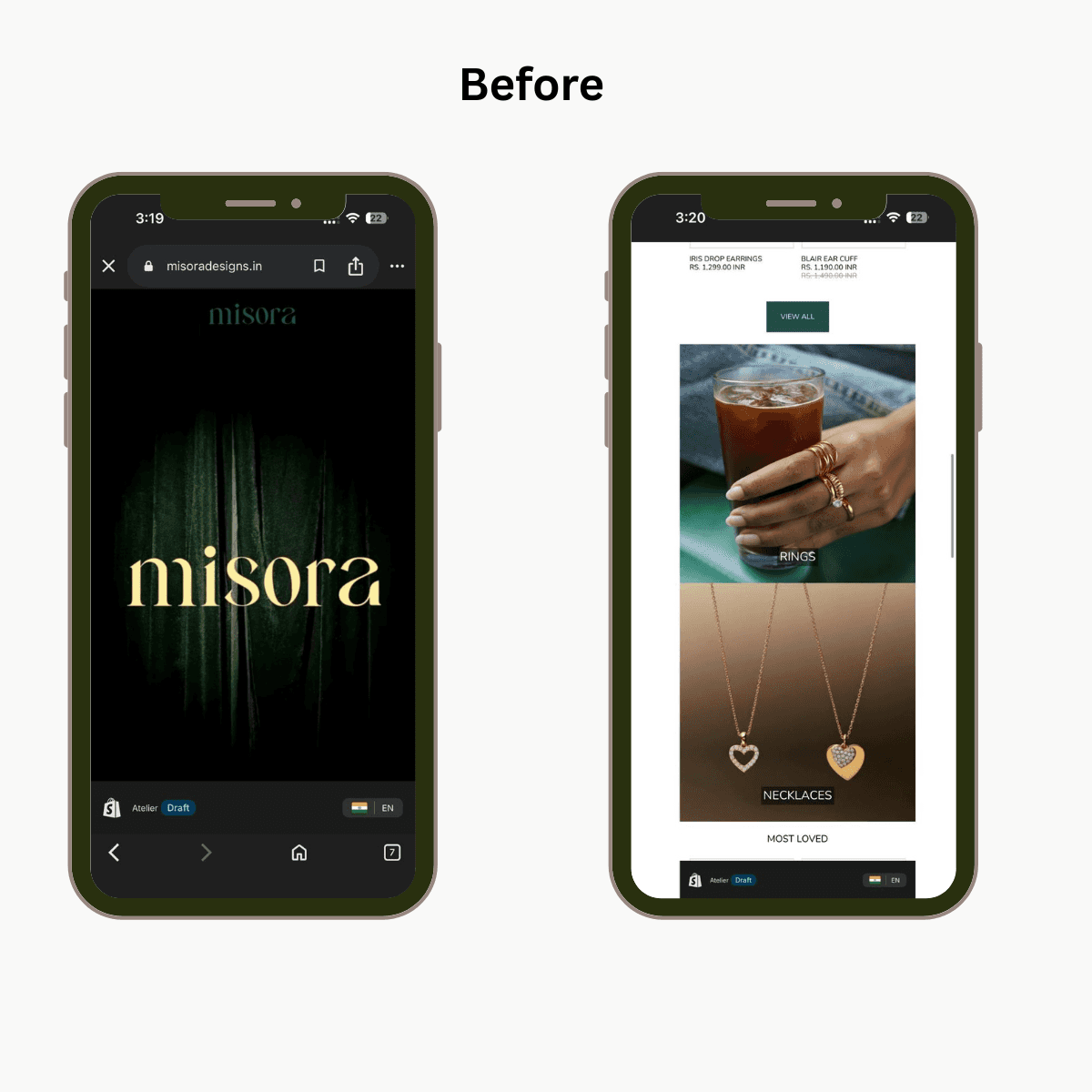
Hero Graphic | A deep emerald-green velvet curtain with a large gold brand logo overlay. Very theatrical but offers zero product context. | An editorial lifestyle collage ("Her Little World") featuring actual models, detailed close-ups of product styling, and an emotional, gift-centric narrative. | Drastically Reduces Bounce Rates: Jewelry requires immediate visual context. Showing real people wearing the products builds instant desire, while shifting the messaging to a gifting narrative leverages high-intent emotional buying. |
Header UX | Standard top bar navigation on a solid dark background; feels slightly disconnected from standard e-commerce flow. | Clean white header sticky-navigation with integrated search, profile icons, and shopping cart utility directly matching high-end Shopify standards. | Frictionless Navigation: Standardizing layout expectations ensures consumers don't have to think about how to browse, immediately reducing cognitive load. |
2. Product Listing Pages (PLP) & Collection Grids
The collection grid was re-engineered from a passive catalog into an active, high-conversion selling machine by adding social proofs and reducing purchase friction.
Feature | The "Before" Version | The Optimized "After" Version | CRO Impact & Strategic Shift |
Catalog Badging | Uses uniform, low-impact dark green | Dynamically swaps generic tags for hyper-specific behavioral triggers: | Social Validation & Scarcity: Generic "Sale" tags can sometimes cheapen a luxury brand feel. Behavioral badges like "Bestseller" trigger FOMO (Fear Of Missing Out) and reassure the buyer that the product is highly coveted by peers. |
Social Proof Integration | Catalog listings contain only product titles, pricing anchors, and color swatches. | Integrates star rating aggregates directly beneath the product title (e.g., | Immediate Trust: Placing direct validation on the catalog page intercepts purchase hesitation before the user even clicks into the product page. |
Purchase Friction (UX) | Users must click through to the individual product page to add an item to their cart. | A floating | Shortens the Sales Funnel: Allows returning, high-intent shoppers or impulse buyers to multi-shop and add items directly to their cart straight from the collection view. |
3. Product Presentation & Aesthetic Context
The way items are modeled shifted from a disconnected, macro focus to integrated lifestyle visuals that subtly communicate luxury and daily utility.
Before Approach: Focused on heavy studio macro photography or generic props—such as holding an iced coffee glass while wearing multiple thick gold rings. While clean, it lacked a defined target audience lifestyle.
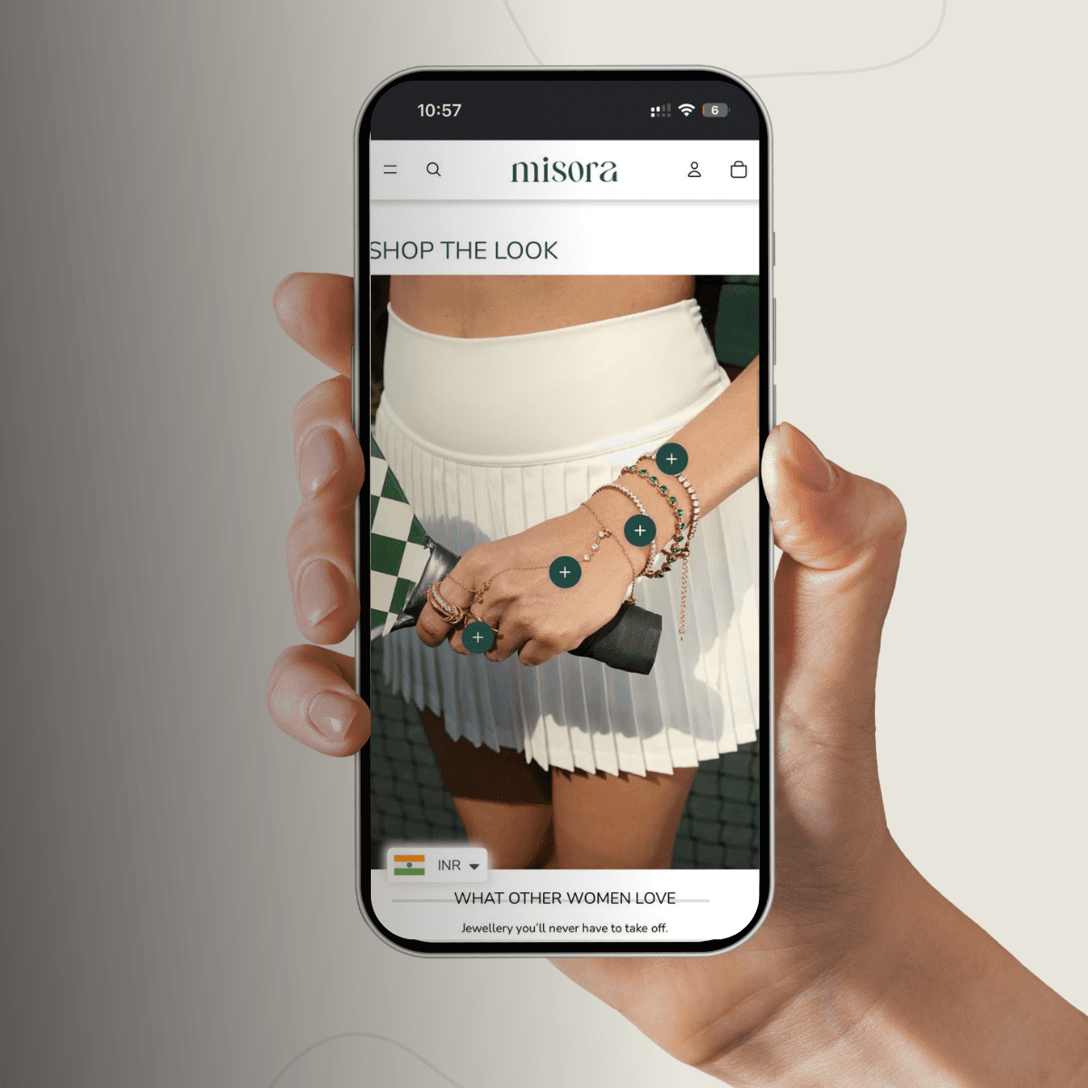
After Approach: Upgraded to targeted lifestyle scenarios, such as the activewear/tennis court aesthetic for the "Shop the Look" campaign. It pairs clean studio cutouts alongside real-world styling.
The CRO Win: Showing demi-fine jewelry in active, upscale everyday settings (like playing tennis) visually validates the brand's core product claims—proving the jewelry is durable, waterproof, and fit for everyday luxury.
4. Upsell Architecture & Average Order Value (AOV)
The bottom funnel strategy was heavily reworked to convert single-item browsers into multi-item bundle buyers.
Before Approach: Simple collection rows categorized by item type ("New Arrivals", "Most Loved") with no direct pathways to purchase matching items together.
After Approach: Implemented interactive "Shop the Look" modules using hotspot tagging (clickable green
+nodes over specific items on a model) alongside dedicated "SAVE 15% EXTRA WITH BUNDLES" discount collections.The CRO Win: Choosing coordinating jewelry pieces can cause choice paralysis. By pre-curating stacks (e.g., the Lustre Sparkle Combo) and assigning a clear financial incentive, the brand successfully increases its Average Order Value while making the decision effortless for the customer.
5. Trust Infrastructure & Footer Optimization
The placement of fundamental trust signals was strategically shifted to protect the user's momentum as they scroll down the page.
Before Approach: Core benefit icons (18k Gold Plated, Waterproof) and utility text links were stacked vertically near the footer on a plain white background, occupying excessive vertical real estate and delaying access to important policy links.
After Approach: Benefit icons were brought right up to the prime real estate directly below the homepage hero image. The footer was consolidated into a sleek, emerald-green container featuring clean dropdown accordions for company info, structured navigation links, an explicit email capture form, and localized currency pickers.
The CRO Win: Moving value propositions to the top handles objections instantly. Consolidating the footer ensures that lingering customers can access sizing guides and refund policies without encountering a cluttered layout.
Summary of Results
By transitioning from a minimalist but passive showcase layout to an active, conversion-optimized architecture, the new website successfully balances a premium aesthetic with high-yield e-commerce mechanics:
Urgency & Validation: Lifted through peer review loops and high-volume sales badges.
AOV Growth: Driven by interactive lookbooks and bundle incentives.
Reduced Drop-offs: Achieved by implementing quick-add functionality and moving trust badges to the top of the funnel.